Xamarin.Forms Using Shell Page
Contents
You may have noticed the similar navigation bars found in apps with many users such as Twitter, Instagram, Spotify. These navigation bars are used to reduce the complexity of the mobile application and increase the user experience. Shell page structure in Xamarin.Forms applications serves this purpose.
In this article, I will show how to use the Shell structure and customize the design in Xamarin.Forms applications. I’ll first create a simple navigation bar and then customize it.
So let’s get started.
What is Xamarin.Forms Shell?
Shell pages came with Xamarin 4.0. You can create popups, tabs, navigation, search, lifecycle, and custom renderers using the shell structure. Thus, you will develop a better quality application in terms of user experience. You also reduce the complexity of your application.
We often see the Shell structure in social media applications. Instagram, Twitter and Tumblr are a good example of applications that use the tabbed page structure.
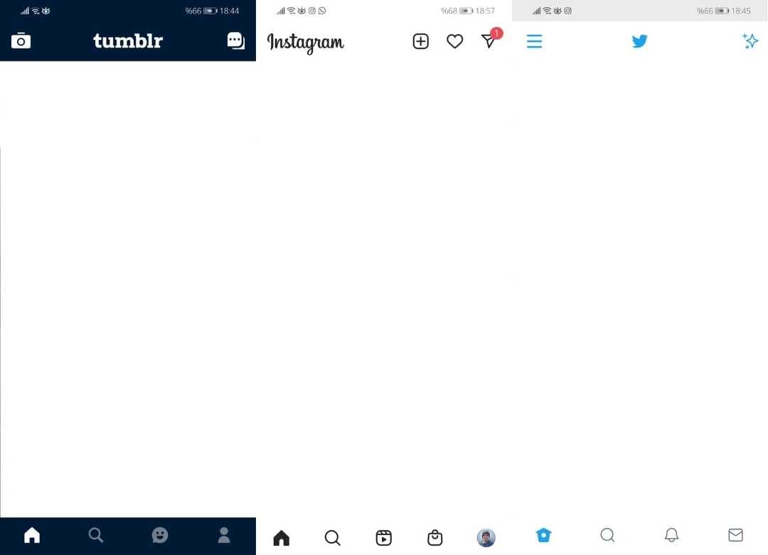
So why do they choose Shell structure? The answer is actually very simple: Increasing the user experience. The secret to success of mobile applications is to increase the user experience. If an application works very well in the back-end but is poor in terms of UI/UX, that application cannot reach a high number of users.
That’s why applications with high user volume generally prefer Shell page structure. Thus, they reduce the complexity of the application and offer a simpler usage to the user. As a result, the user experience increases and they reach more users.
Shell Page Usage
You can apply the Shell structure to your Xamarin.Forms applications by following the steps below in order.
We can use the ready Tabbed template while developing an application in Xamarin, but here we will learn how to use the Shell structure over the empty application. So create an empty Xamarin.Forms application.
1 The first thing you need to do is to find icons suitable for the other pages of your application to appear in the tabs of the Shell page. If your application will have pages such as home page, search, profile, you should choose the appropriate icons.
There are many categories of icons in Material Design. Here you can download the icons you want in SVG and PNG format.
2 Then drop the downloaded icons into the Android/Resources/drawable folder of your project. Media files of Android apps are located in the drawable folder.
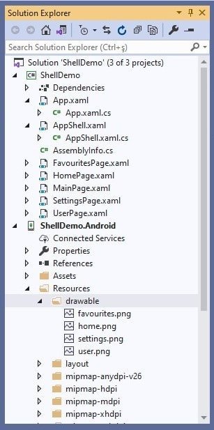
3 Now create the pages that will be in the tabs. Create a ContentPage for each page. I created HomePage, SettingsPage, FavoritesPage and UserPage pages for my project.
Add AppShell.xaml Page
4 Then right click on the project and add a new ContentPage named “AppShell”. Shell page in Xamarin.Forms is often called “AppShell”.
5 And make the AppShell.xaml.cs class inherit from the Shell class, not the ContentPage class. Thus, you declare that the AppShell page is a Shell.
    public partial class AppShell : Shell
    {
        public AppShell()
        {
            InitializeComponent();
        }
    }
6 The page you add is in ContentPage structure. However, because we want to use Shell structure, replace ContentPage with Shell.
<Shell xmlns="http://xamarin.com/schemas/2014/forms"
             xmlns:x="http://schemas.microsoft.com/winfx/2009/xaml"
             xmlns:d="http://xamarin.com/schemas/2014/forms/design"
             xmlns:mc="http://schemas.openxmlformats.org/markup-compatibility/2006" xmlns:local1="clr-namespace:ShellDemo"
             mc:Ignorable="d"
             x:Class="ShellDemo.AppShell">
</Shell>
7 Now add the tabs of the app’s bottom navigation bar. Add a <Tab> for each tab between the <Tabbar> tags. Add the title, icon and content page of these tabs as follows.
    <TabBar >
        <Tab Title="Home" Icon="home.png">
            <ShellContent>
                <local1:HomePage />
            </ShellContent>
        </Tab>
        <Tab Title="Favourites" Icon="favourites.png">
            <ShellContent>
                <local1:FavouritesPage />
            </ShellContent>
        </Tab>
        <Tab Title="Settings" Icon="settings.png">
            <ShellContent>
                <local1:SettingsPage />
            </ShellContent>
        </Tab>
        <Tab Title="User" Icon="user.png">
            <ShellContent>
                <local1:UserPage />
            </ShellContent>
        </Tab>
    </TabBar>
Customize Shell Page
8 Now let’s play with some design. By defining <ResourceDictionary> in <Shell.Resources> , we can change many controls of the page such as BackgroundColor, TitleColor, TabBarBackgroundColor.
- BackgroundColor, defines the background color in the Shell page.
- DisabledColor, defines the color to shade text and icons that are disabled.
- ForegroundColor, defines the color to shade text and icons.
- TitleColor, defines the color used for the title of the current page.
- UnselectedColor, defines the color used for unselected text and icons.
<Shell.Resources>
        <ResourceDictionary>
            <Color x:Key="NavigationPrimary">#2196F3</Color>
            <Style x:Key="BaseStyle" TargetType="Element">
                <Setter Property="Shell.BackgroundColor" Value="Pink" />
                <Setter Property="Shell.ForegroundColor" Value="#7175D8" />
                <Setter Property="Shell.TitleColor" Value="#303960" />
                <Setter Property="Shell.DisabledColor" Value="#B4FFFFFF" />
                <Setter Property="Shell.UnselectedColor" Value="#95FFFFFF" />
                <Setter Property="Shell.TabBarBackgroundColor" Value="Pink" />
                <Setter Property="Shell.TabBarForegroundColor" Value="White" />
                <Setter Property="Shell.TabBarUnselectedColor" Value="#9d8f8f" />
                <Setter Property="Shell.TabBarTitleColor" Value="#303960" />
            </Style>
            <Style BasedOn="{StaticResource BaseStyle}" TargetType="TabBar" />
        </ResourceDictionary>
    </Shell.Resources>
Set AppShell.xaml Page as MainPage
9 Finally, replace MainPage with AppShell in the App () constructor method of the App.xaml.cs class. Thus, the main page of the application will be the AppShell page, not MainPage ().
        public App()
        {
            InitializeComponent();

            MainPage = new AppShell();
        }
Run the application and see how it looks.
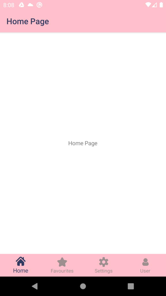
Customize Material Theme
After completing the steps above, you can change fields such as statusBarColor, navigationBarColor by customizing the material theme. To do this, change the colorPrimaryDark color in Android / Resources / values / styles.xml.
<item name="colorPrimaryDark">#FFC0CB</item>Conclusion
In summary, tabbed page structure greatly reduces complexity in mobile applications. Naturally, the user experience also increases. That is why multi-user mobile applications prefer tabbed page structure today. You should also develop your Xamarin applications with a tabbed page structure.
In this post, I explained the features and usage of Shell structure with an example. Additionally, I showed you how to customize the design. I hope it was useful.
If you’re still not sure what to do, then I suggest you use the comment section below and let me know! I am here to help!
